The Client
Positive Changes is a premier provider of hypnotherapy and coaching based in Nottingham. Positive Changes opens the door to healing your mind and your body. Repairing. Rejuvenating. Inducing positive and lasting change.
Our Approach
Our subjective approach to creating the new logo is to evoke a feeling of excitement and possibility for change.
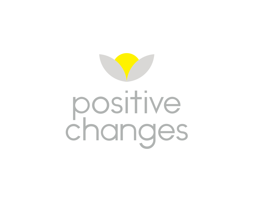
On first glance the logo depicts a yellow flower in bloom for joy, new beginnings and happiness. The striking contrast of grey leaves convey transition and the process of changing from one condition to another. On second glance the logo depicts the sun coming up from the hills and an awakening to convey hope and positivity. The sun represents the self, life and vision.
We utilise the font Noir to evoke a sense of wholeness and completeness. In particular we love the character ‘T’ which forms a cross with intersecting lines evoking a positive energy.
The Result
“Inbetween indeed are Courageous Creatives, intuitive and innovative in their approach, offering new and insightful perspectives, having the courage and conviction to offer these. Our new branding has led to fully booked clinics and profound change to our clients lives”.
Claire Cross
Founder – Positive Changes

Ready for the journey?
If you’d like to work with a full service marketing agency with an ever growing reputation for ground-breaking creativity, we’d love to work with you. Let’s start with a coffee and a chat.
0115 7523869 | hello@inbetweencreative.co.uk